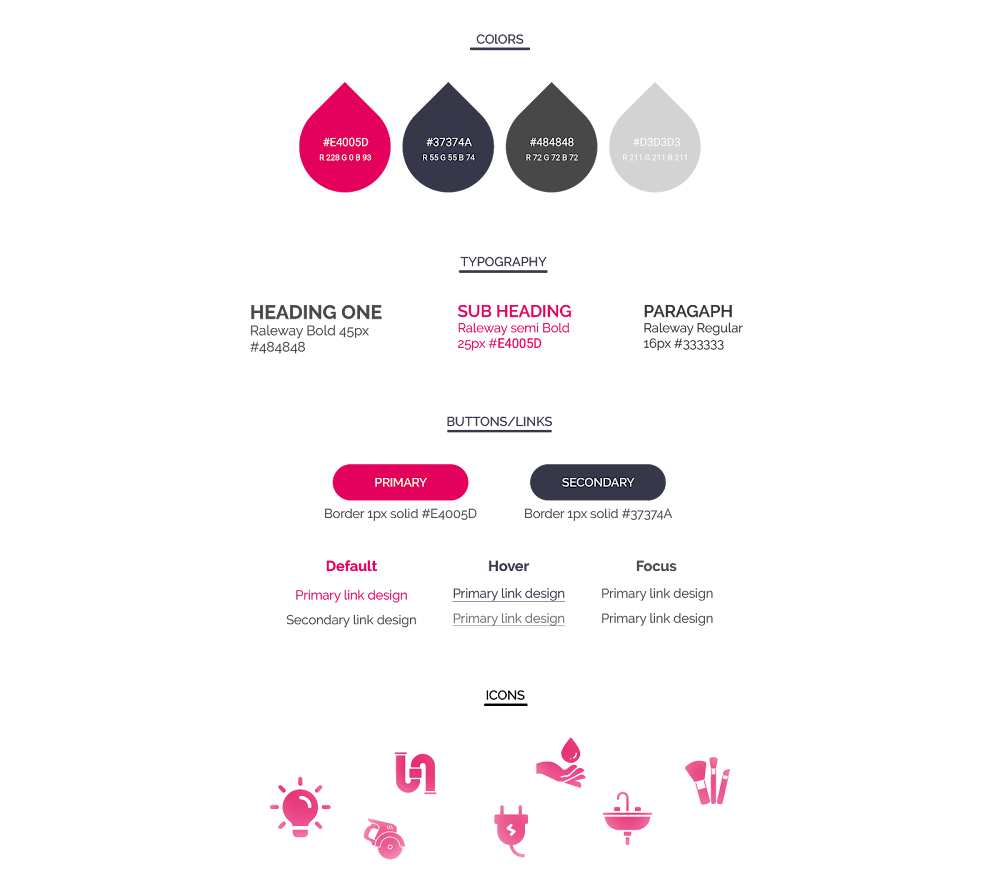
I am a multidisciplinary designer who is passionate about user-centric design. I am well versed with front-end development (HTML, CSS and Media query). My experience includes creating interactive hi-fidelity prototypes, designing wireframes, advanced PowerPoint presentations, newsletters, emailers, web banners and brochures.
In the last 5 years I have worked with Capgemini consulting and Accenture, where my main role was conducting user interviews for gathering requirements from different clients and creating UI designs based on guidelines.
I am fascinated by the convergence of human behaviour and product design and therefore approach problems in a collaborative and iterative manner. I believe in simple and intuitive human-platform interactions, and prioritize design thinking as an effective means of solving problems. Insights from constant research help me create a base for an informed design approach.
Portfolio
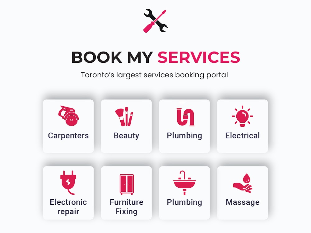
Book my services
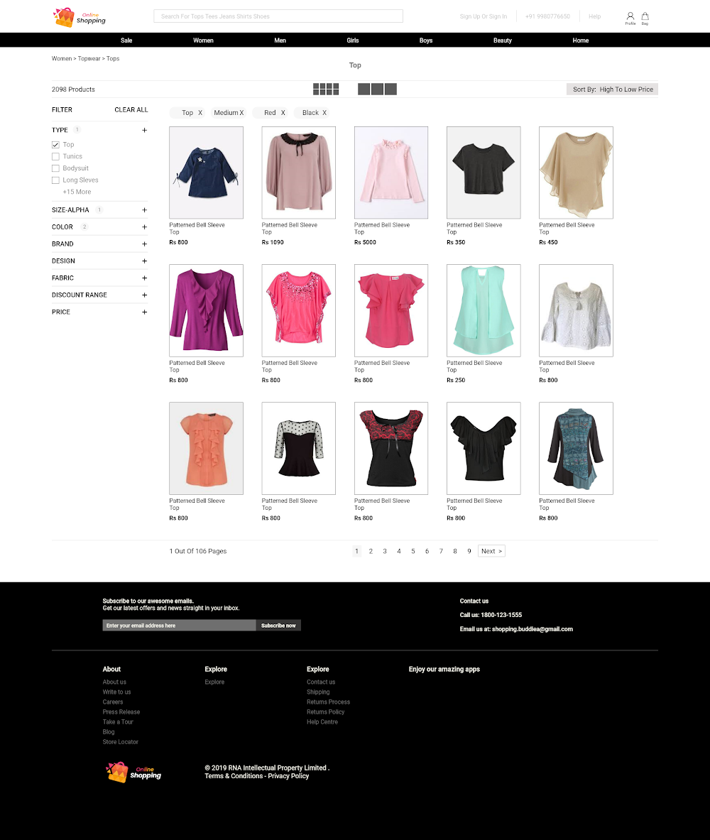
(Service booking platform)
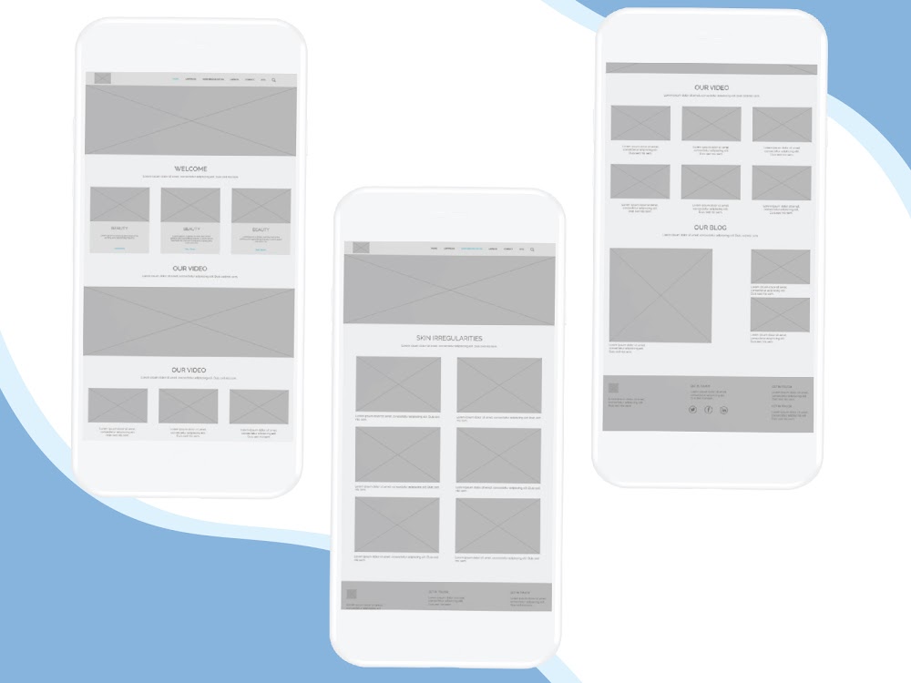
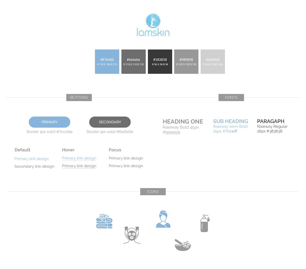
Lamskin
(Skin care professionals)
People portal
(Human resources and recruiting)
Training module
(learning and development)
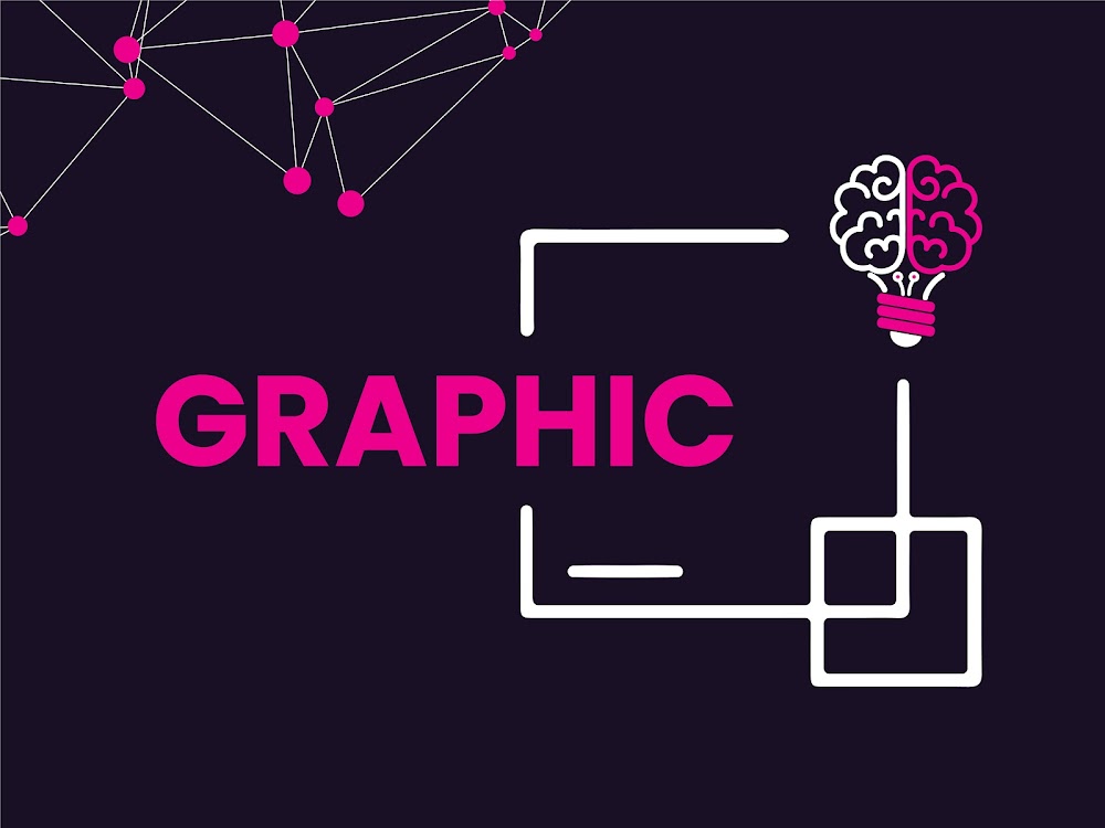
Graphic designs
HTML/JPGS
UI Designs
Few examples of past UI projects
Experience
My UX Journey!
2020
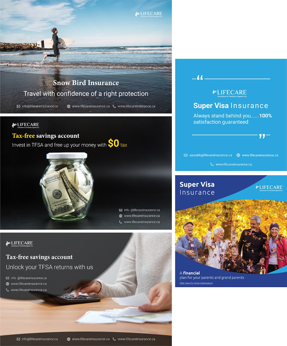
Lifecare Insurance Canada
I am currently work as an UX designer intern at Lifecare Insurance Canada
2019-2020
Interactive Media Management
Interactive media management helped me create better empathy towards my users. It is also a simple process in which I could create products and experiences that are more meaningful and relevant to my users.
2018-2019
Accenture Digital
In Accenture I worked both in the print and digital field. This helped me get my experience in both web and print media.
2014-2018
Capgemini Consulting
I joined Capgemini as a PowerPoint design specialist. After which I got an opportunity to work with the UX team to work on more digital projects. They also gave me an opportunity to speak to my clients to better understand their needs and come up with creative design solutions to solve problems.
2011-2014
B.SC (I.T.)
My Study at St. Andrews college helped me understand the technique of writing complex code in a simple manner. With courses like website designing and development helped me get a kick start in this UX industry.
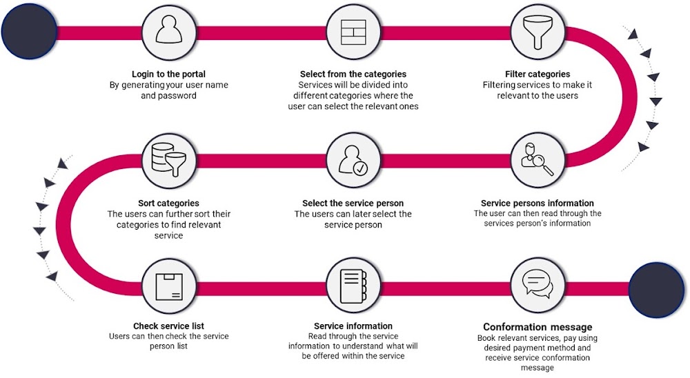
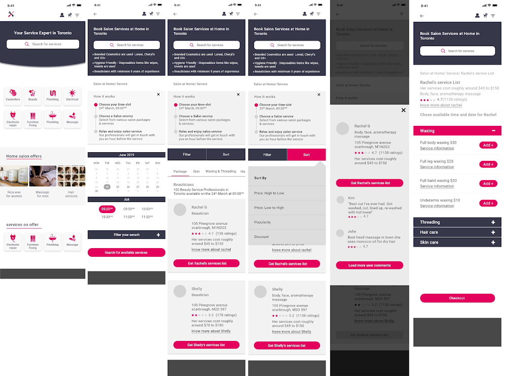
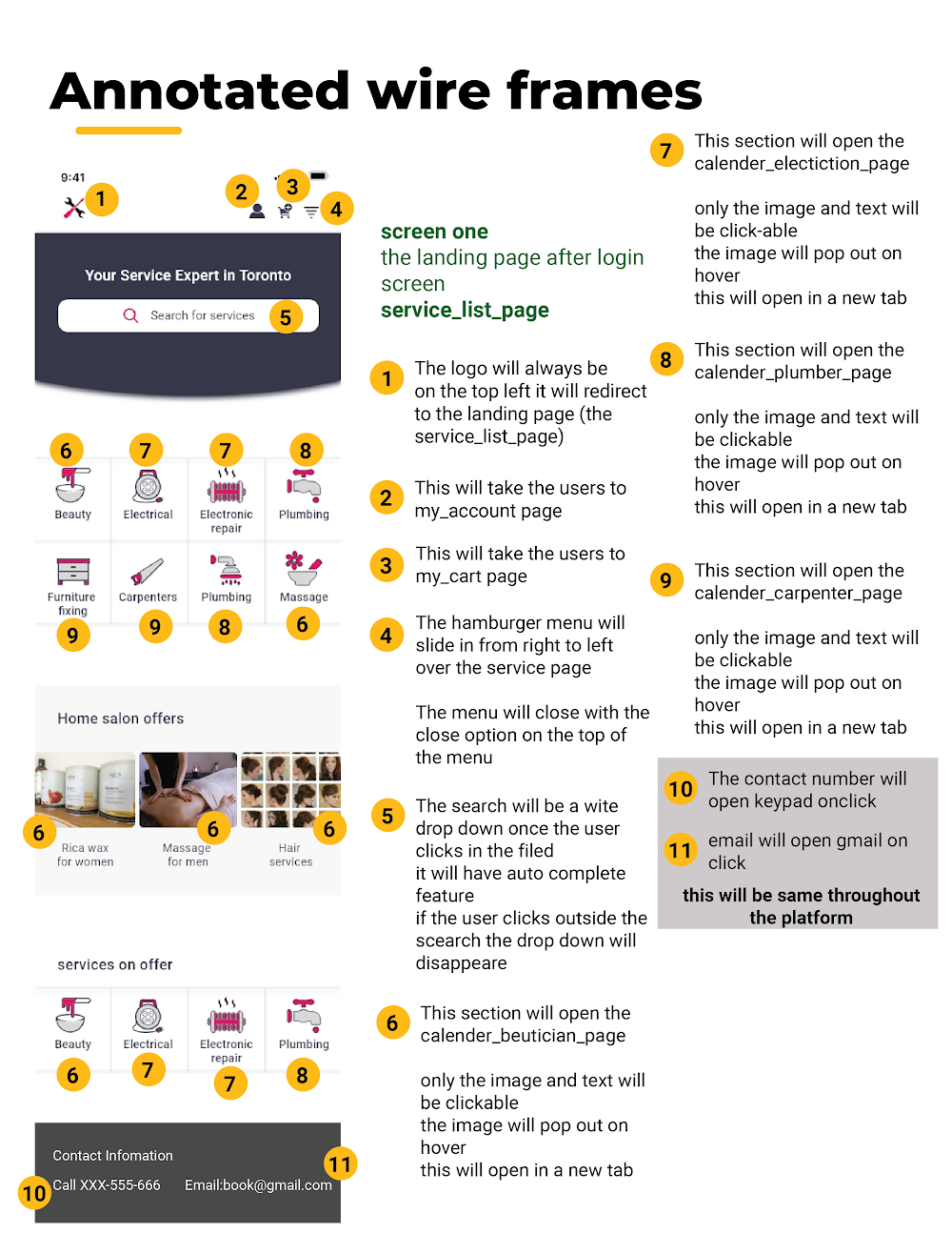
A platform that connects services providers to people who need services (at your door step)
Date: January 2020 to March 2020
Project Status: Development
Category: Web application
Project information
This is an easy-to-use and uncluttered platform, which is a one-shop stop for all your local professional services at your doorstep. Examples of services provided - Housekeeping (Plumbers, Electricians, Carpenters, Cleaning, Pest Control, etc.) & Personal services (Beauty, Spa, Mobile and electric appliance repairs, Fitness, Music lessons, etc.). Users can directly call the service, book or track appointments through the platform.
Problem statement
As there is a demand for services like Kijiji, Yelp and Angie’s List, my solution is to create an environment which would incorporate all of them in one place, since none of the existing services provide such a solution at your doorstep.
My role
As a UX designer I had to find an easy way of connecting users to the correct service person in such a way that the user could read through the complete service description and the service persons background before hiring them.
Tools used
Microsoft word, Sketch, Adobe photoshop, Bracket
Research phase
Yelp is one service which is slightly similar to the platform I am proposing. While food and restaurants are its main focus, it also enlists local services and businesses which cater to making it convenient for users to connect with them. The way the user has to navigate through Yelp’s interface, makes it really hard to search for what a user is looking for. It also does not let you book an appointment through its platform. Handy is another app which is synonymous for when you specifically need to get home repairs or installation done. But then it only caters to this niche vertical.
So, I decided to come up with a portal that will address these shortcomings and make it easy and simple to book the appointments for a service of your liking. I will categorize similar services together in verticals and then give the user to view ratings and descriptions of the service provider. An approximate cost will also be provided beforehand. The platform will install trust in the user by assuring him/her of the quality and reliability of the service.
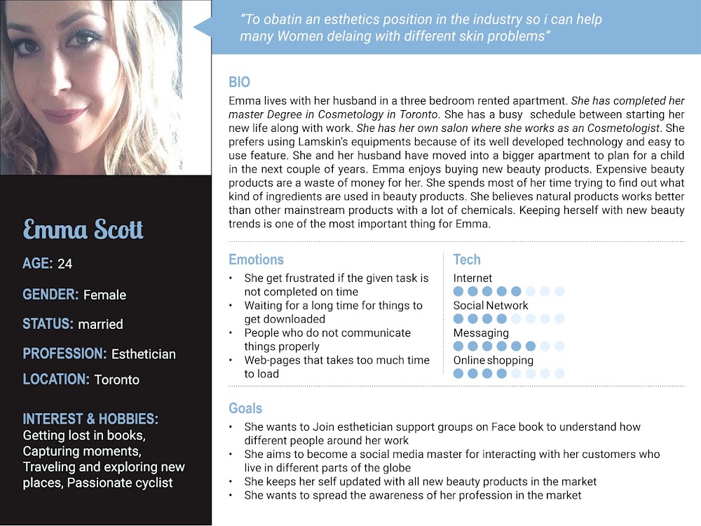
Persona
We created two personas, one is Mike who is in his early 70’s and needs helps with handy man services. Another persona named Naomi is a single mother and a working professional, who finds it very difficult to leave her infant child alone at home during the weekend to get her beauty services done at a salon where she has to wait for her turn.
The final idea
Making it convenient for users to find relevant services. My platform will help users find their desired service in an organized manner. It helps build trust in users mind by providing a brief explanation of the service person who will be coming to the user’s place. This platform helps local business who do not have a platform to get recognized by people to get market exposure
specialist in providing the most technologically advanced equipment, product, and educational resources to modern aesthetic, medical, and med spa
Date: October 2019 to December 2019
Project Status: Development
Category: Website
Project information
Lamskin are beauty professionals that help aestheticians, and med spa owners with skin care machines and manuals that help these professionals use these skin care machines, Lamskin main product Lamprobe helps aestheticians, and med spa owners treat different skin care conditions.
Lamskin needed help to advertise their product digitally in the Canadian market, they also wanted their clients to be aware of their 40 years of experience in the beauty industry. Along with buying the expensive Lamprobe product they wanted their clients to know about the free professional tutorials they offered while using this product.
Problem statement
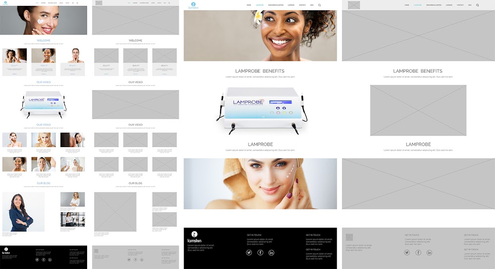
Lamskin had two website Lamskin and Lamprobe, the users used to land on Lamskin’s website, but while browsing through Lamprobe details they used to land on a completely different website which lead to user confusion.
Lamprobe is a machine sold by the company Lamskin, and it is a high-end piece of equipment used only by licenced aestheticians. Due to the fact that one Lamprobe machine costs thousands of dollars, a customer would want to know more than the standard amount of product information before buying it.
My role
As a UI designer I had to Structure the content along with relevant images on Lamskin’s website, I had to find a way of merging both Lamskin and Lamprobe into one website. As the owner of Lamskin’s website did not want to display the cost of Lamprobe on the website I had to find out a way where the skincare specialist could ask Lamskin’s professionals for the cost of the machine.
As a UI developer I Created a new section on Lamskin’s website for incorporating Lamprobe’s details. I created a separated video section where the aestheticians could view different tutorials of Lamprobe. I created a pop up which had different questions these aestheticians could ask while finding the price for Lamprobe.
Tools used
Microsoft word, Sketch, Adobe photoshop, Bracket
Research phase
From a user experience perspective, Lamskins competitor’s website has a modern and fun aesthetic. They keep the written content on the website to a minimum and instead allow users to consume content in sections, through fun pictures and large font.
It is important to take into consideration that in the past few years, Lamskin’s competitors have been extremely successful with their reach with clients. According to industry professionals, the main reason why they are successful is because they have a strong online presence (rather than the functionality of their machine).
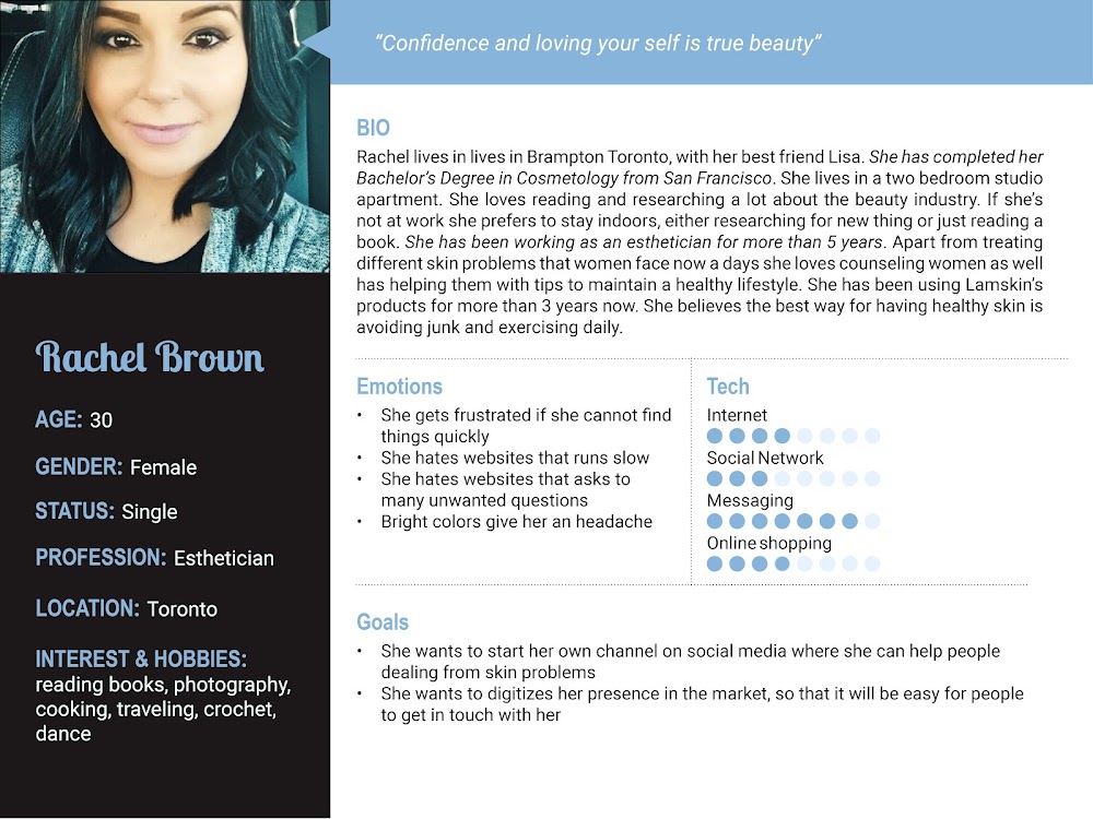
Persona
We created two personas of skincare professionals we tried to understand what details they look for while buying any expensive skin care products over the internet.
The final idea
Merge the Lamskin and Lamprobe websites into one (1) website, Make sure the free training workshops content is visible to the people who visit the website
People portal (Human resources and recruiting)
Helping ‘Recruiting Professionals’ select the right candidate for the job, this portal also helps make the process of recruiting fun and interactive.
Date: June 2017 to August 2017
Project Status: Development
Category: Website
Project information
This portal was shared with the clients as a reference while selecting a candidate to work on their ongoing task. This portal contained complete information about each individual working in the consulting team and the tasks that have been assigned to them.
Problem statement
Before the development of this portal, the project managers used to send a long excel document that contained information about different consultants and the work they did. The problem with this excel document was that it was very difficult for the client to find the right candidate for the job by using keywords. It was also very boring to scroll multiple rows in excel to find the right candidate for this job.
My role
My role as a Jr. UX researcher in this project was to understand what the client looks for before they hire any consultant from the team.
As a UI developer I had to come up with a design idea where the consultant could upload all his projects into the portal on his own, after which the clients could view these projects before hiring them.
Tools used
Microsoft word, Adobe XD, Adobe photoshop, DSLR cameras (For taking professional images of all consultants), Bracket
Research phase
At this stage, after having a brief conversation with the client. we realised that they hire people based on their skills and past experience, if the skill requirements and experience matched the job description the consultant would more likely be hired.
Persona
We created two personas of recruiters, this helped us understand what they look for while hiring candidates for the project.
The final idea
We came up with a portal that had the entire information about the consultant and the work that was done by the team, to make it a bit personalised we added images and a short description of the consultant along with their skills.
Training module (learning and development)
Helping Professionals select the right training to improve their skills.
Date: October 2016 to December 2016
Project Status: Development
Category: Website
Project information
This training groups are online/in class education providers that offer working professionals access to massive open online and in classroom training, specializations, and certifications.
Problem statement
The current training portal used by consultants in the team was developed poorly. It made it difficult for the consultants to find relevant training to learn new skills. Training goals and costs relevant to the Training's were not mentioned upfront.
Positive points like the consultant would receive a certification after the completing of the training was not mentioned on the current site.
My role
As a UX researcher I tried to understand what the company has to offer, who were their target audience and what they used to look out for while searching for training.
As a UI designer I had to categorize multiple trainings into relevant groups, Important details like if the training is an in class room training, date, time and cost associated with it had to be mentioned before the user could book his seat for the training.
Tools used
Microsoft word, Sketch, Adobe photoshop, Bracket
Research phase
We analysed the entire website to understand the current issues with the page, we got to know that this website only told the users about upcoming training. It did not give any other details about the training.
Consultants used to book their seats for the training and later realised that this is an in-class room training rather than online, hence they used to just book their seats and later not attend the training this led to waste of classroom seats and cost billed to the team.
Persona
We created two personas of working professionals from the team who like participating in training to improve skills. We tried to understand what they look for before booking their seats for the training.
The final idea
We came up with an idea of categorizing Trainings into relevant groups, this made it easier for them to navigate essentials trainings.
We improved their search functionality by adding auto-fill and auto-correct. Even if the consultant searched for something that was not in the current website, it prompted them to the most relevant item
Important details associated with the trainings like (date, time, in classroom or online, Certifications, and benefits associated were mentioned up front)
Once trainings were booked the consultant could opt for future reminder in the form of a message or email a day before the training
Graphics(Reminders, updates, emailers & posts)
These emails for most designed in html for providing the teams with monthly reminders and updates.
Date: October 2015 - october 2018
Project Status: Development
Category: Emailers
Design Ideas
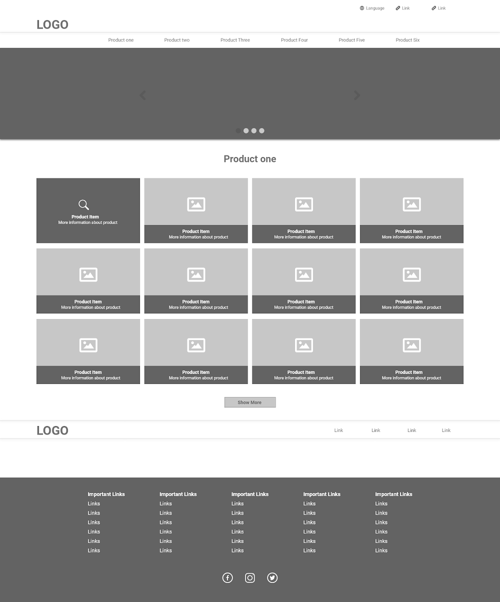
UI Designes (websites and dashboards)
These website designs were created by me in the past. Some of them are live projects and others were interview tests.
Date: October 2015 - october 2018
Project Status: Development/Design
Category: Websites/Dashboards
Design Ideas
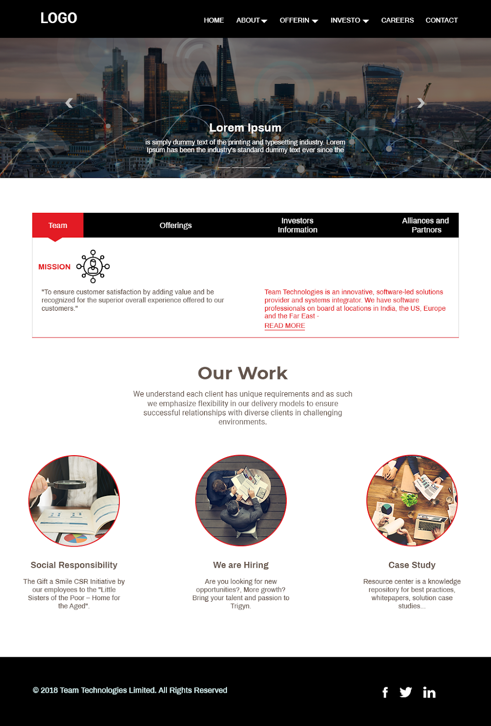
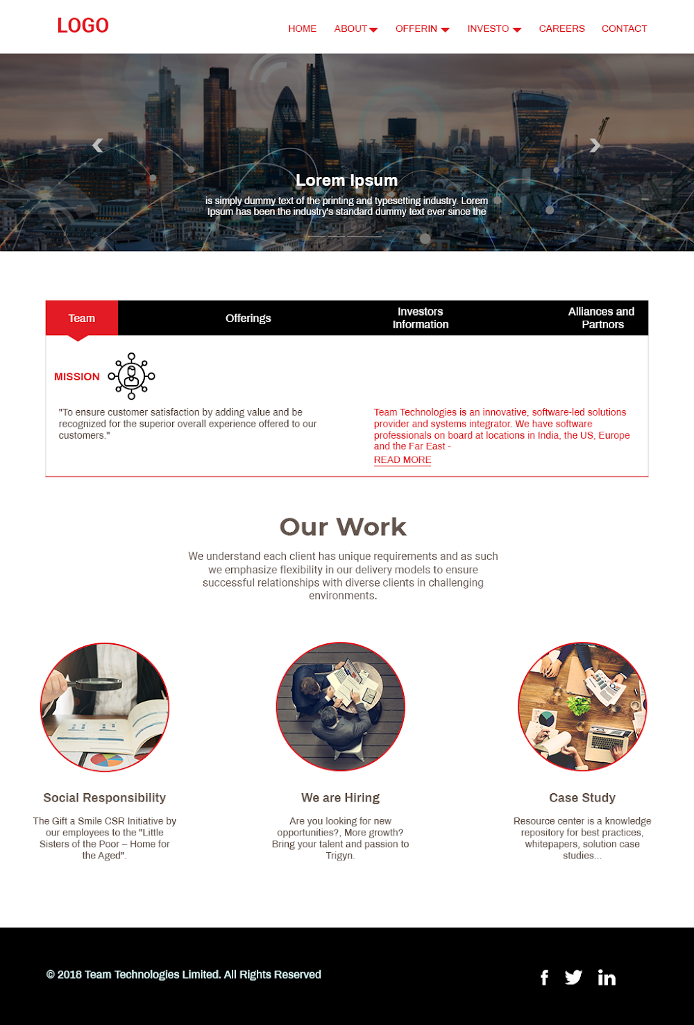
This was an example of a test which was given to me by the recruiters. In this test I have to come up with a new design for his website, I also had to create the HTML page for this design.
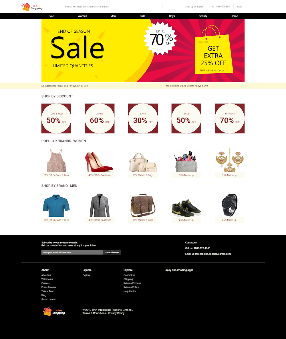
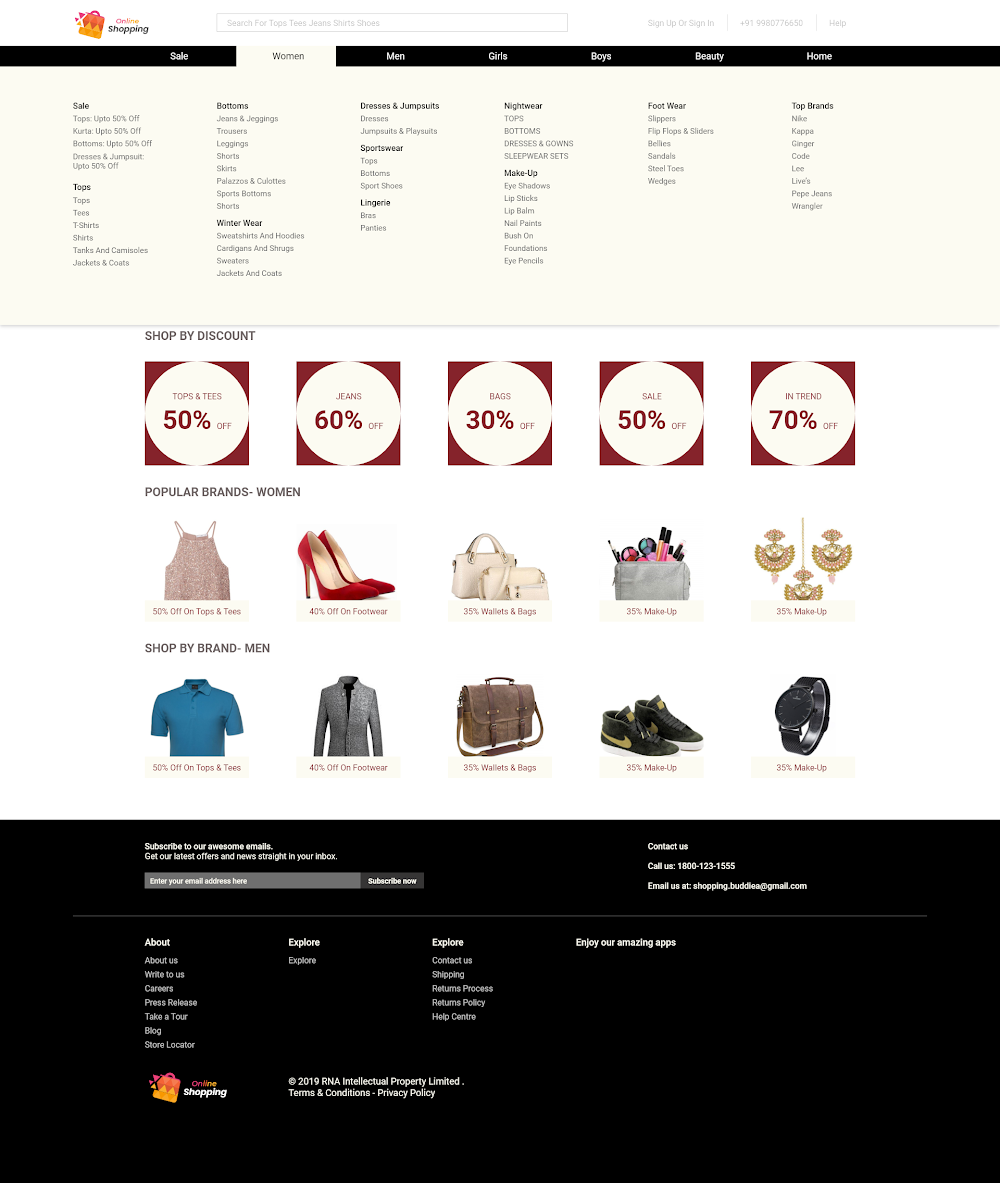
This was an example of a mega menu design created for an agency that had an ecommerce project in line.
Practice project
This was a practice project taught to us in a UX traning session, which told us it is best to allow users to read a liitle bit about the product before getting into the product discription page.